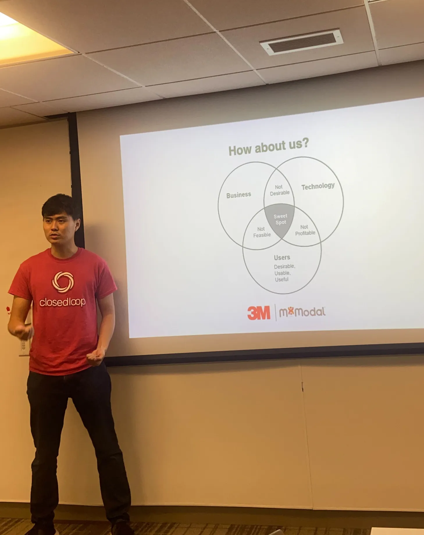
 M*Modal · Enterprise healthcare AI · 2 years
3M's AI had the answers.Clinicians had a workflow.I designed where the two meet.
3M M*Modal's AI could catch missed diagnoses worth real revenue, but its raw output arrived with no sense of how billing works, where worklists actually live, or how much attention a clinician has to spare. As the suite's sole designer, I redesigned the review experience around those realities — recreated below as a working product you can click through.
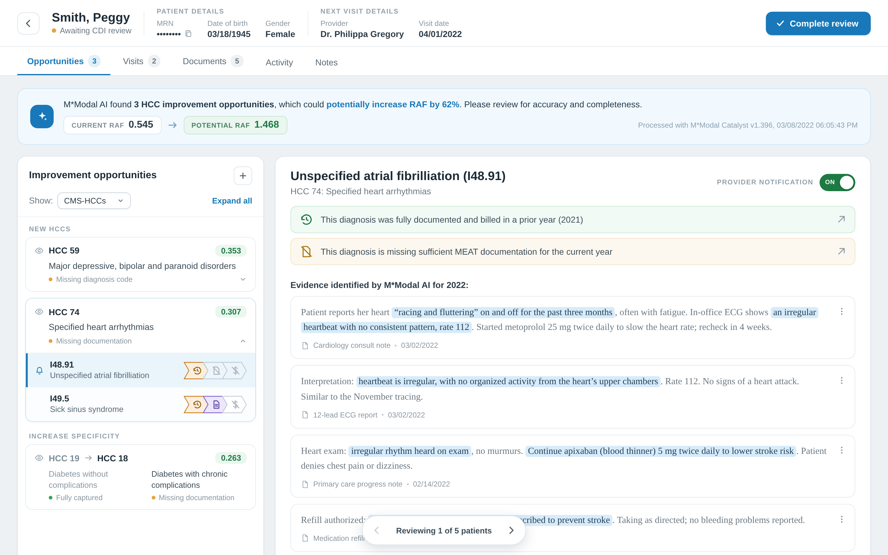
Every answer the AI found arrived looking exactly the same.
The legacy screen rendered each finding as an identical row: a code, a source note, a date. Everything a specialist needed to decide was a click away — per diagnosis, per patient, all day.
- Hidden status: prior-year, current-year, and billing state sat one click deep
- Wasted review: no HCC grouping, so outranked categories still demanded attention
- Bypassed worklist: no way in for team leads' lists, so specialists stayed in Excel
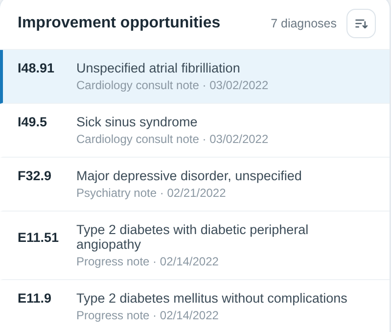
Four changes carry the redesign
Each one restores a context the raw AI output ignored and traces to something a specialist did in front of me, not something a stakeholder said.
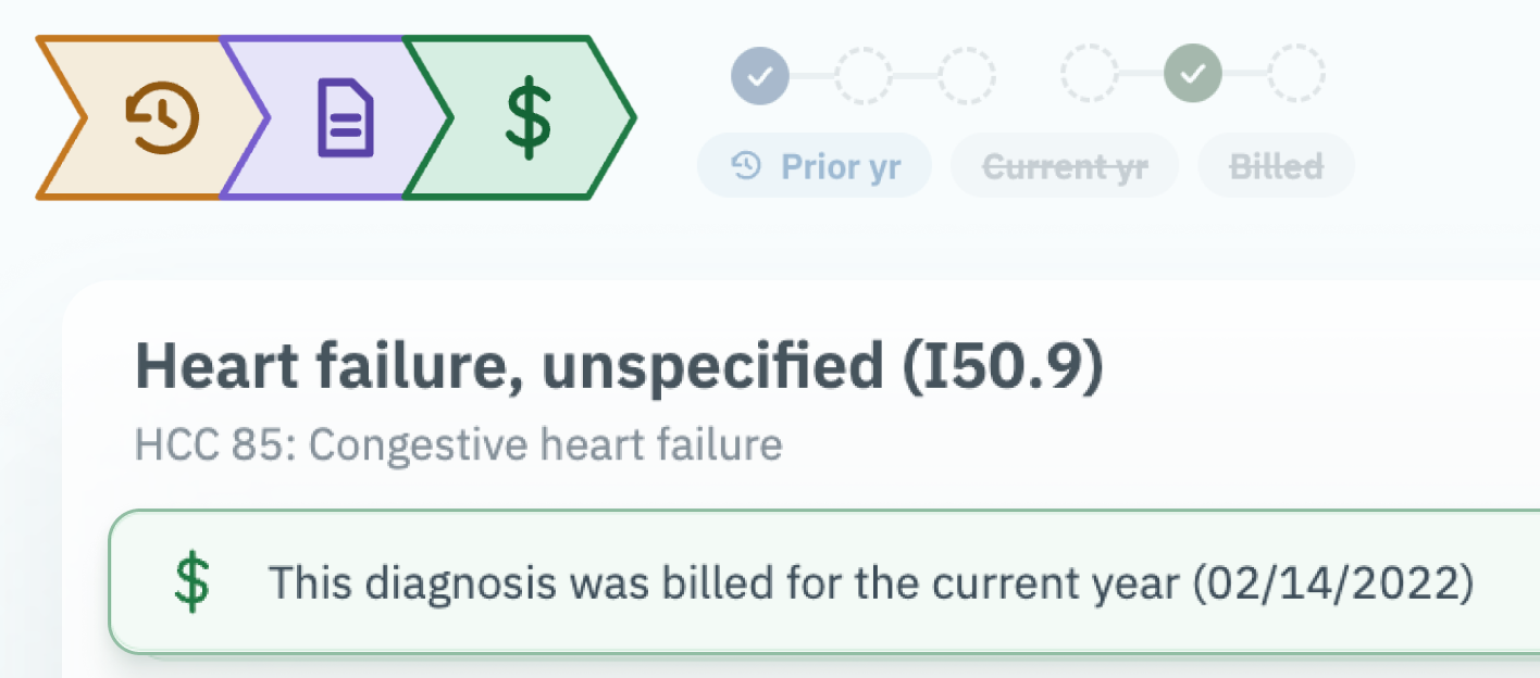
Status you can read at a glance
Prior-year, current-year, and billing state used to hide behind a click into every diagnosis. I tested five treatments; tinted icon chips shipped.
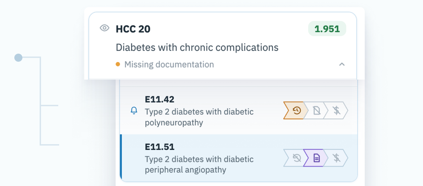
Grouped the way billing works
Specialists think in HCCs, the categories that decide reimbursement. Grouping by HCC and flagging outranked categories ended review work that could never matter.
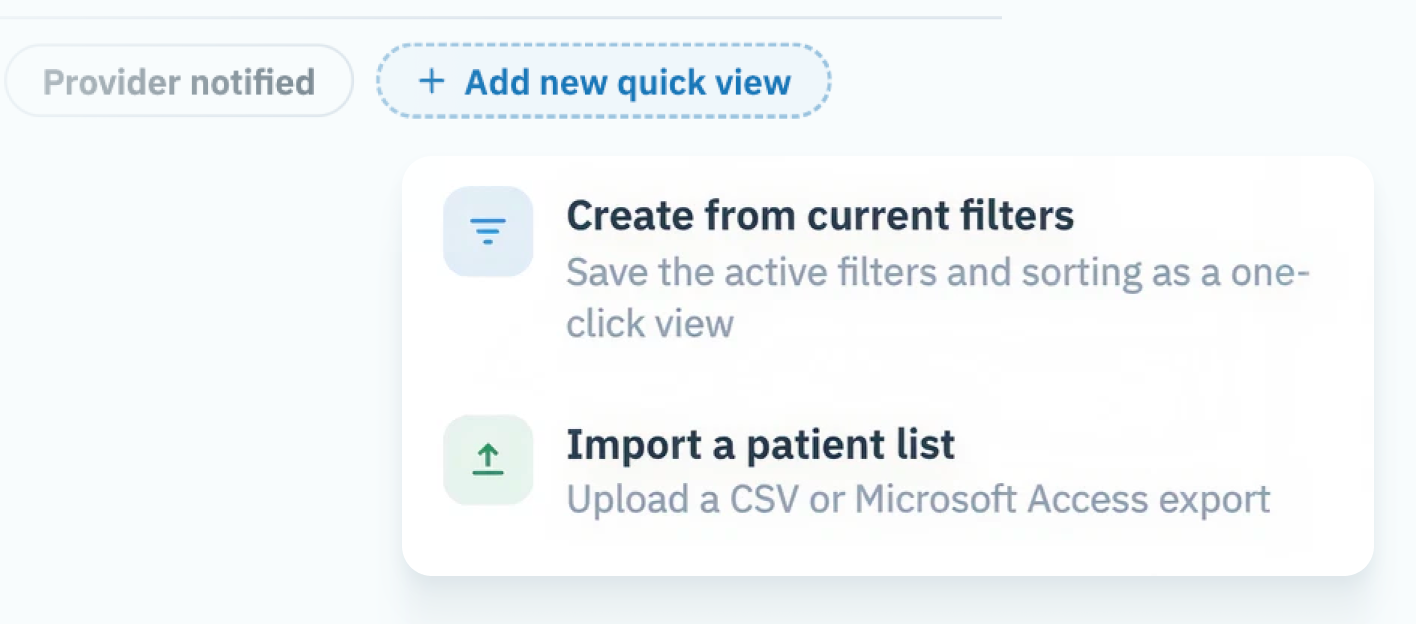
Quick views from the lists teams already use
Upload the CSV or Access export a team lead already maintains, and every specialist gets a one-click, pre-filtered worklist.
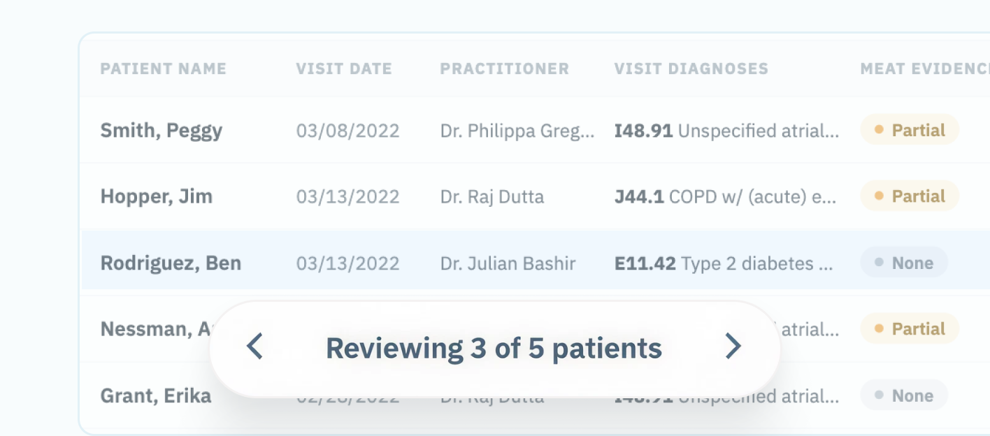
Stay in flow across a patient list
A sticky pager (“Reviewing 1 of 5 patients”) moves straight to the next chart. No round-trips to the worklist between patients.
The data said we weren't the main character. I made the case for us to avoid the trap of doing everything.
Only about 20% of specialists worked from our worklist. The rest lived in Epic, and in Excel or Access lists their team leads assigned. That number, backed by what I saw at every site visit, convinced leadership to stop competing for the center of the workflow.
So the redesign meets specialists where they already work. Quick views ingest those lists, and the pager keeps them moving through one.
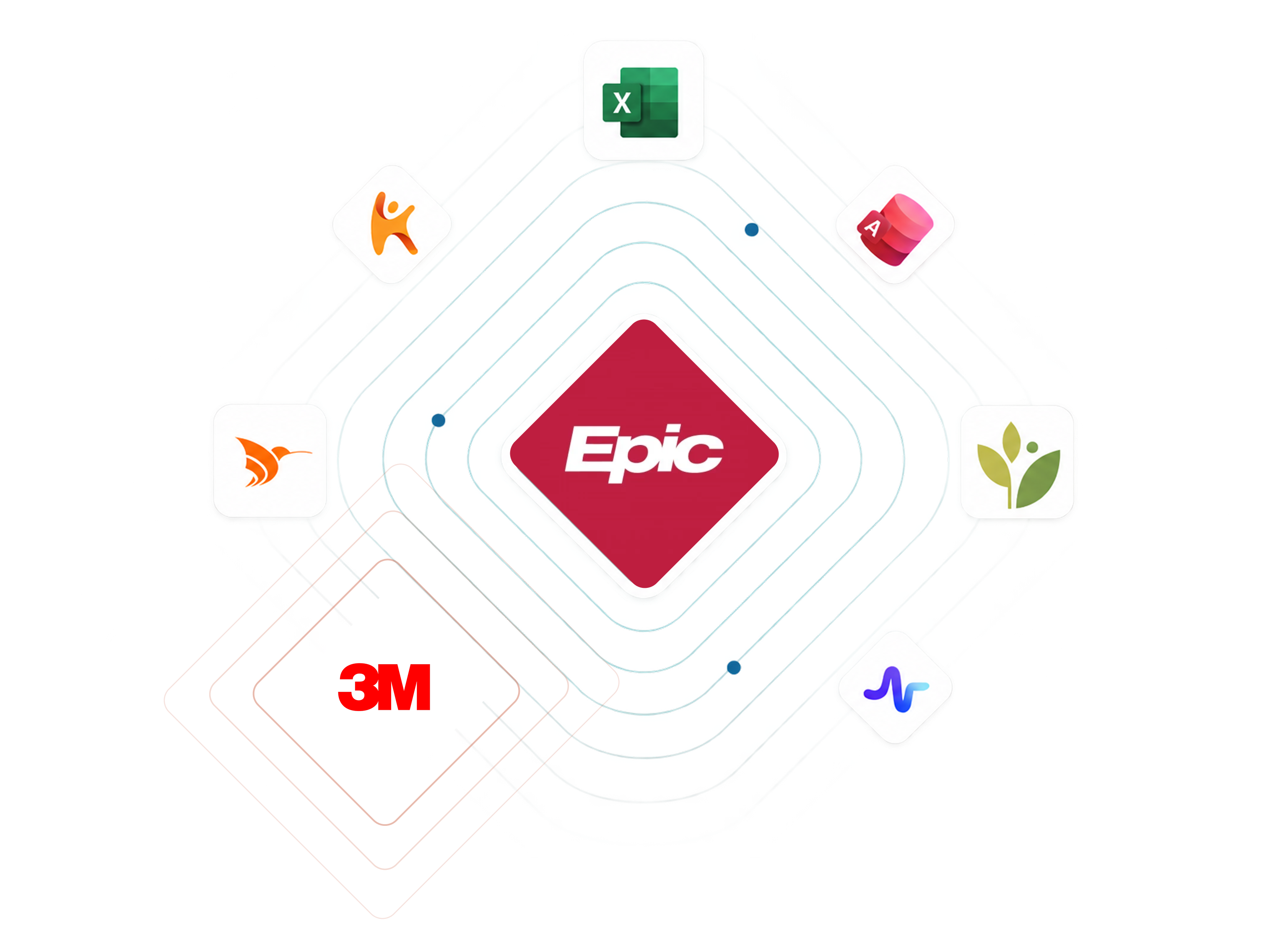
The strategy argument behind the redesign: leadership wanted us to be the main tool in the clinician's ecosystem. My research showed the faster route to their own adoption goal was to be a great supporting tool.
Specialists get all day.
Doctors get five seconds.
The worklist you just played with is a full-day professional tool, information-dense on purpose. But the same AI also surfaces nudges to doctors mid-visit, while a patient sits across from them.
I led both ends: a compact desktop widget that earns a glance without competing with the patient, and the dense review workspace it hands off to. Same engine, opposite information densities, because the attention economics of the two users are opposite.
Specialist · a desk and all day
~40 data points on one screen
Comparing beats calm.
Doctor · a patient in the room
3 data points, one decision
Calm beats completeness.
How loudly should the AI announce itself?
Meeting clinicians where they are includes their trust posture. Doctors asked us to label what the AI found versus what humans found. Too loud, and they dismissed the AI wholesale. Too quiet, and they couldn't calibrate trust. I tested three levels:
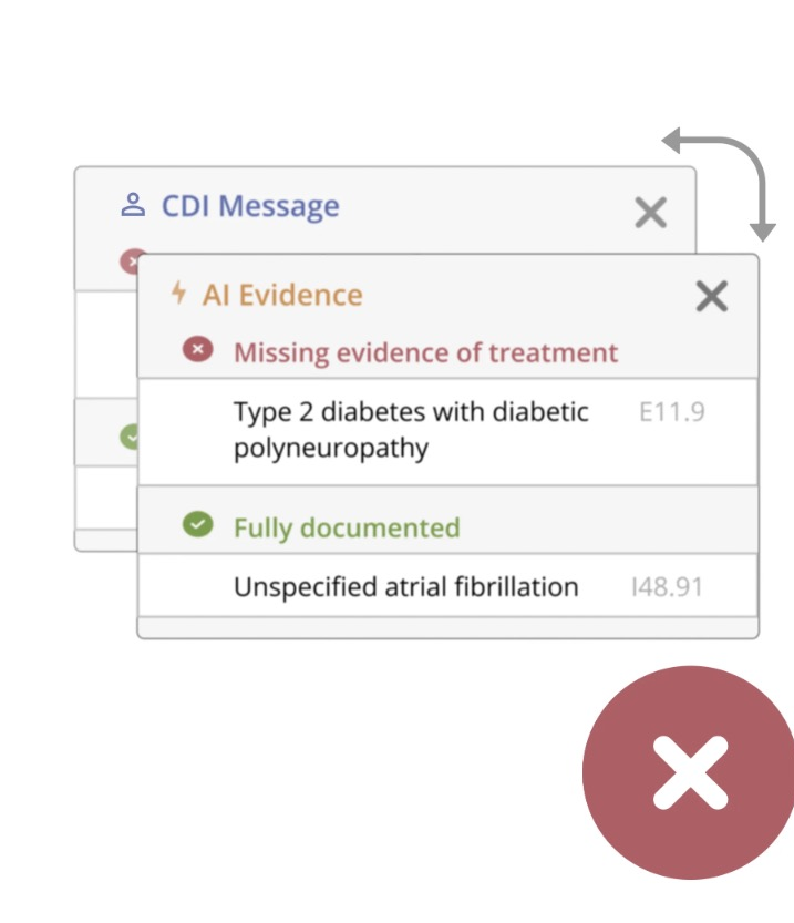
A · Separate AI section
RejectedDoctors disregarded AI content entirely. Hard separation turned into bias against the machine.
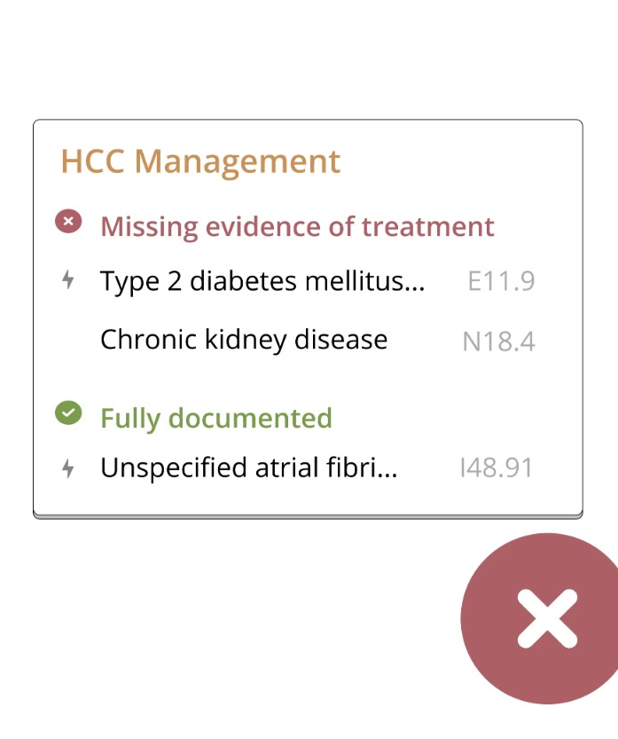
B · Icon on AI items
RejectedFewer dismissals, but the icon needed training to understand and collided with existing icons.
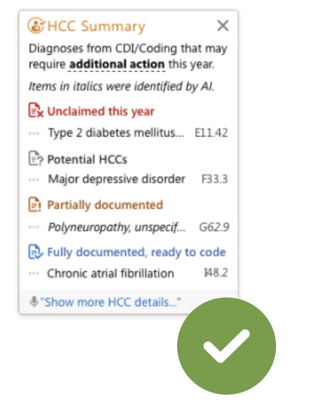
C · Italics for AI items
ShippedSubtle provenance. Power users could read the source; nobody was dissuaded from acting.
The middle ground existed. Finding it took behavioral evidence, not opinion.
The new 3M redesign is a lot better to look at compared to the old design. It has been much easier for the team to prioritize what to work on.
Shipped with 3M messaging, this work contributed to a 25% lift in chronic-condition diagnosis capture, the documentation that decides how hospitals are reimbursed for the care they already give.




Three things 3M taught me
Clicks are a buyer's metric, not a user's
Stakeholders judged designs by click count, because clicks are countable. I learned to re-anchor debates on what specialists actually lose: errors, wasted reviews, broken flow.
Not knowing the domain is a research tool
I had no medical training in a field full of experts. Asking the basic questions surfaced assumptions everyone else had stopped seeing, and made the tool legible to newcomers too.
Spotting a problem isn't the same as fixing it
As the only designer among ~30, I owned whatever I flagged: research recruiting, analytics, advocacy. That instinct is why this rebuild exists at all.